Illuminated Letters
The art of illuminated letters, generously displayed in the Medieval manuscripts, was predominant in Europe between the 4th and 16th centuries. The letters of gold used in early medieval manuscripts were mostly confined to copies of Scriptures and devotional books, written for princes or for monasteries. An example is the “Codex Argenteus”, the 6th century copy of the Bible of Bishop Uphilas, written in silver and gold letters, on a purple background. Uphilas’ work was written about A. D. 360.
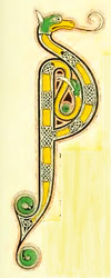
Illuminated Letters: from
The Lindisfarne Gospels
8th century
The process of laying and burnishing gold and silver is old, and was enhanced in the Byzantine Empire by writing with such letters on vellum, stained in purple or rose color. The taste for gold and purple illuminated letters reached England at the close of the 7th century, when Wilfred, Archbishop of York, enriched his church with a copy of the Gospels.
In the 8th and 9th centuries, the colour, be it purple, violet, or rose, is no longer as bright and beautiful as in the preceding centuries. It appears that the art itself declined. Manuscripts illuminated throughout are hard to find, the artist decorating mostly the title, preface, or canon of the mass. Illuminated lettering of gold on white vellum is chiefly confined to the 8th, 9th, and 10th centuries. Writing in gold was less used in the 11th, 12th, and 13th centuries, but came again into favour in the 14th, particularly in devotional books of high rank persons.
This time, however, a different technique was used, the gilding being applied in leaves, not in a liquid state. In the Byzantine Empire, the usage of writing whole pages in gold continued to its latest period.
The initial letters of early manuscripts were not distinguished in size from the rest of the text, which was written in capitals, and the color scheme was simpler than the one used at the end of the 7th century. From the 7th to the 11th century, at the beginning of books and chapters, the initial letters are of a larger size. They could be composed of human figures, animals, birds, fish, or flowers.
The Irish school of Illumination has a distinct lettering style, with a particular design and execution, marked by extreme intricacy of pattern, and interlacings of knots in a diagonal or square form. These patterns were sometimes interwoven with animals, and terminations in heads of serpents, or birds. Dotted red lines were used round the edge of large letters. Towards the close of the 10th century, the Hiberno-Saxon illuminated manuscripts were remarkable for correctness of design, and a richness superior to any work executed on the Continent. Magnificent examples are the The Benedictional of St. Æthelwold, written and illuminated c. 973, and the Benedictional of Archbishop Robert at Rouen, c. 980.
Copies of the Bible were frequently of a great size, and the letters at the beginning of books and chapters were on a corresponding scale, with highly accurate and intricate scroll work. It looks like the favourite animal introduced in ornamental design during the Middle Ages was the lizard, its form made to harmonize with various design curves. This motif was extensively used during the 12th century.
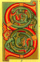
English Illuminated Letter
13th century
When the letters were simpler, the outlines were usually red, and the foliage and figures without colour, with the spaces between in various tints. In more elaborated examples, the letter was done in burnished gold, and the surrounding foliage formed a mass of vivid colours, brought into harmony with each other. The letter and the details are made distinct by a strong black outline. A delicate light blue and bright green were generally used in England and France for titles and initial letters, a pattern continuing till the middle of the next century.
In the 13th century, the larger illuminated letters were composed chiefly of scroll work, more intricate and more elaborated than in the previous century. The backgrounds are often masses of burnished gold, while the letter is surrounded with delicate diaperings, foliage, and grotesque monsters.
Illuminated Letter, 12th Century,
English
During the 14th century, the illuminated lettering and the paintings had a similar character. In England and France the large initial letters were purple, red, and gold, containing figures of men and animals, and terminating in spiral scrolls. These extended along the upper and lower margins of the page, often supporting small groups of animals or images of the pastimes of the period. Letters were delicate, similar to exquisite lace-work or embroidery, the bole threads at the ends of the patterns being twisted into graceful spiral terminations.
During the 15th century, the ornaments and letters were based more on the study of Nature, grotesque monsters being replaced with flowers, fruits, birds, and insects, delicately coloured upon gold backgrounds, in a perfect execution.
In the early part of the 16th century, miniature painting acquired a new importance, as it was also practised by the great painters of the time. The greatest illuminator, never surpassed, was Giulio Clovio, a native of Croatia who practised in Renaissance Italy. His paintings combine all the refinement of Italian Art in composition and colouring. Some critics dispute his merits, considering that his illuminations are actually small paintings, done in very crude, bright colors, without the solemnity of older religious art.
After the invention of printing, the art of illuminated letters made steady progress for about a century. After that, the decline began, and although the art still existed so late as the 17th century, it was rarely practised, and almost wholly confined to religious and heraldic books.